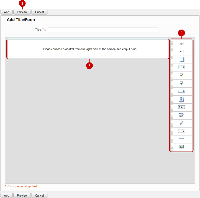
To Create Form
Display create screen.
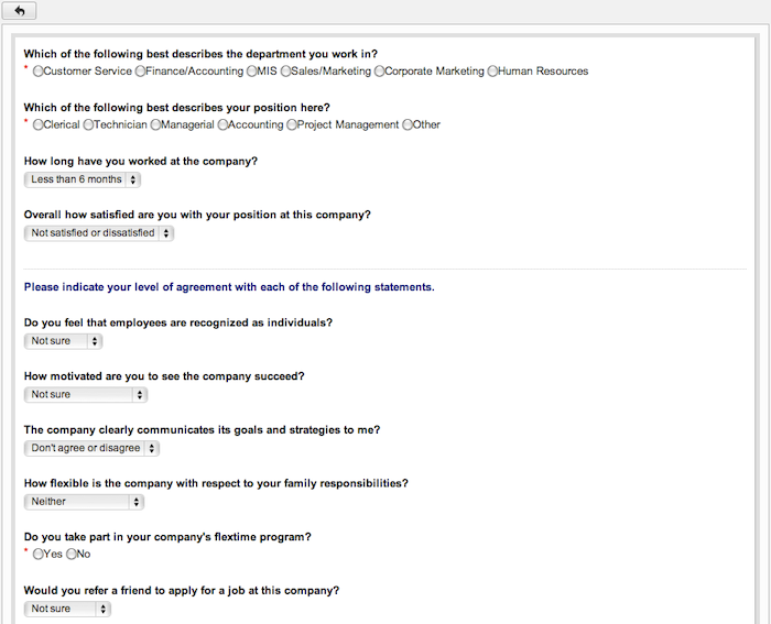
* The following explanations are based on "Title/Form Settings" screen of Questionnaire.
-
Display the form being created in a preview screen.
-
Controls are displayed.
Hold down the mouse button over the grip of a control and move the mouse to the center space. When you release the mouse button, the control is placed.
(Please refer to To Add Control for more details.)
-
The controls you placed are displayed.
When the entry is complete, press "Add" button to save the data.
To Add Control
You can freely use 14 form controls to create a form.
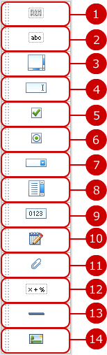
- Select and Place Controls from Control List
When you press a control and hold down the mouse button, and then move to the center space, the blue border is displayed where you can place the control.
When you release the mouse button, the control is placed.
* If you choose a control from the control list and insert the control, the setting window is open automatically.
* If you want to open the setting window after you placed a control, press the icon of a control.
* If a controls is "Label (Single Line)" or "Label (Multi Line)" and its Text Alignment is "Center" or "Right", you cannot place controls on the left and right of the control.
* You cannot place controls on the right of a "Horizontal Line" control.
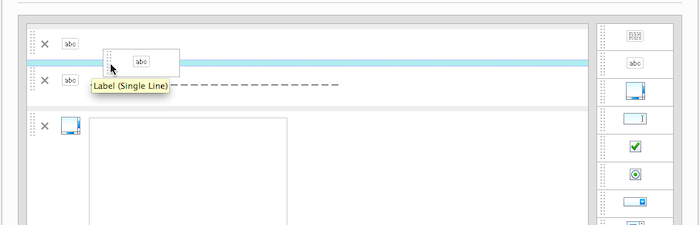
To Move Control
You can move controls you placed by using mouse easily.
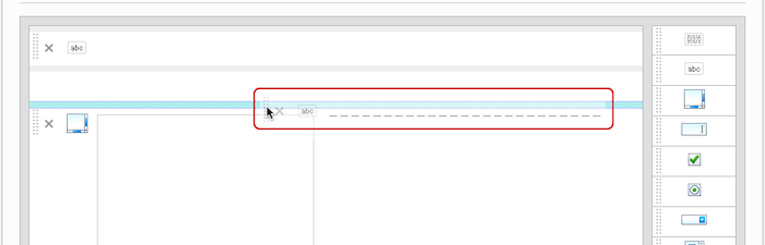
When you press and hold down the mouse button over the left side of a control, you can move the control.
If the mouse pointer is near a place where you can move the control, the blue border is displayed. When you release the mouse button, the control is moved.
* If a controls is "Label (Single Line)" or "Label (Multi Line)" and its Text Alignment is "Center" or "Right", you cannot place controls on the left and right of the control.
* You cannot place controls on the right of a "Horizontal Line" control.
To Display Preview
When you press "Preview" button, you can see how the controls you entered are displayed.
You can check text decorations and locations of controls.
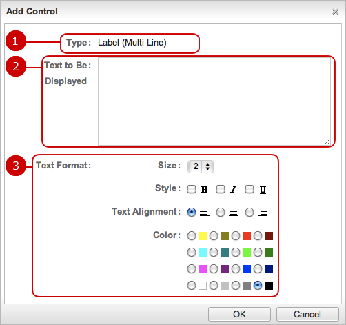
To Add Control (Label (Multi Line))
With this control, you can set size, color, etc. to text. Since it allows to display multi line text, it can be used to display important text.
-
The type of control is displayed.
-
Enter a text.
-
Set the text format.
Size... Choose a size of 1 to 9.
Style... Choose "Bold", "Italic" or "Underline".
Text Alignment... Choose "Left", "Center" or "Right".
Color... Choose a color of 16 colors.
After all entries are completed, when you press "OK" button, the control is added.
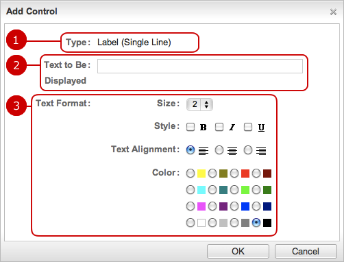
To Add Control (Label (Single Line))
With this control, you can set size, color, etc. to text. It can be used for a title.
-
The type of control is displayed.
-
Enter a text.
-
Set the text format.
Size... Choose a size of 1 to 9.
Style... Choose "Bold", "Italic" or "Underline".
Text Alignment... Choose "Left", "Center" or "Right".
Color... Choose a color of 16 colors.
After all entries are completed, when you press "OK" button, the control is added.
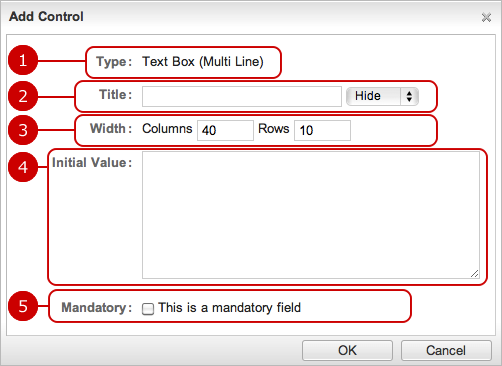
To Add Control (Text Box (Multi Line))
This control can be used to enter multi line text in Workflow or Questionnaire.
-
The type of control is displayed.
-
Enter a title text of the control.
If you choose "Display", the title text is displayed on the input field.
-
Set the number of columns (width) and rows (height).
-
Enter a text displayed as the initial text.
-
Check if this field is a mandatory field.
If you choose this option, * symbol is displayed.
After all entries are completed, when you press "OK" button, the control is added.
To Add Control (Text Box (Single Line))
This control can be used to enter a comment in Workflow or Questionnaire.
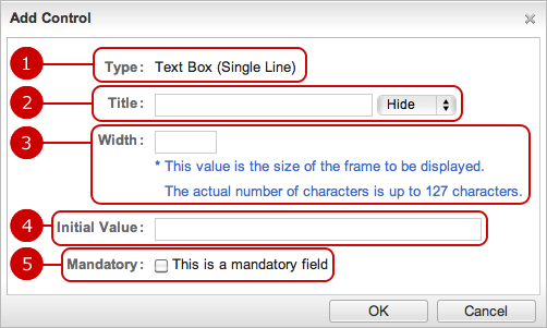
-
The type of control is displayed.
-
Enter a title text of the control.
If you choose "Display", the title text is displayed beside of the input field.
-
Set the width.
-
Enter a text displayed as the initial text.
-
Check if this field is a mandatory field.
If you choose this option, * symbol is displayed.
After all entries are completed, when you press "OK" button, the control is added.
To Add Control (Check Box)
Use this control to select multiple items.
This can be used to select multiple answers to a question in Questionnaire.
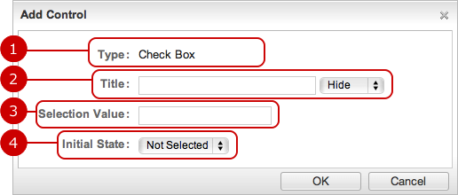
-
The type of control is displayed.
-
Enter a title text of the control.
If you choose "Display", the title text is displayed beside of the check box field.
-
Enter a selection value of the check box.
-
Specify whether it is checked or not as the default.
After all entries are completed, when you press "OK" button, the control is added.
To Add Control (Radio Button)
Use this control to choose one item.
This is useful to ask meeting attendance (e.g. attendance, nonattendance).
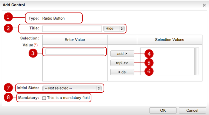
-
The type of control is displayed.
-
Enter a title text of the control.
If you choose "Display", the title text is displayed beside of the radio button field.
-
Enter a selection value of the radio button.
-
Add the selection value.
When you "add >", the value is added in the list.
-
Replace the selection value.
Replace the value you selected in the list by the value you entered in Enter Value field.
-
Delete the value.
Delete the value you selected in the list.
-
Set the initial state.
Choose a value of Selection Values.
-
Check if this field is a mandatory field.
If you choose this option, * symbol is displayed.
After all entries are completed, when you press "OK" button, the control is added.
To Add Control (Pull down)
Use this control to choose one from several items.
The control can be used when you want to make a selection, for example place of business trip.
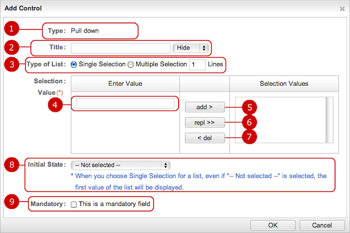
-
The type of control is displayed.
-
Enter a title text of the control.
If you choose "Display", the title text is displayed beside of the pull down field.
-
Choose a type of selection.
Choose either Single Selection or Multiple Selection.
If you choose "Multiple Selection", enter how many lines to be shown.
-
Enter selection values.
-
Add the selection value.
When you "add >", the value is added in the list.
-
Replace the selection value.
Replace the value you selected in the list by the value you entered in Enter Value field.
-
Delete the value.
Delete the value you selected in the list.
-
Set the initial state.
Choose a value of Selection Values.
-
Check if this field is a mandatory field.
If you choose this option, * symbol is displayed.
After all entries are completed, when you press "OK" button, the control is added.
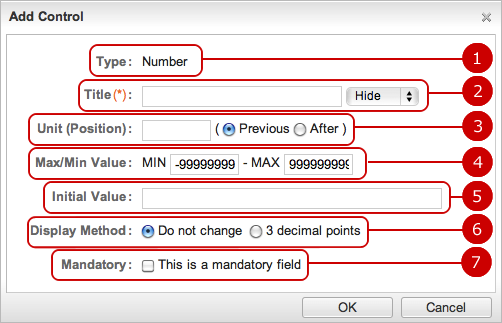
To Add Control (Number)
The control can be used to enter number such as amount, quantity.
* You can use the controls with auto calculation controls to calculate numbers.
-
The type of control is displayed.
-
Enter a title text of the control.
If you choose "Display", the title text is displayed beside of the input field.
-
Specify the unit of the number.
The text is shown before or after the number field.
-
Specify maximum and minimum values.
-
Enter a text displayed as the initial text.
-
Display method is displayed.
Select whether to display to 3 decimal points or as it is.
-
Check if this field is a mandatory field.
If you choose this option, * symbol is displayed.
After all entries are completed, when you press "OK" button, the control is added.
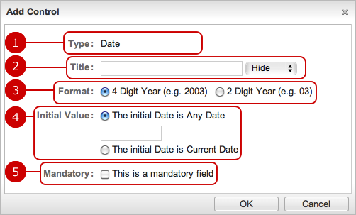
To Add Control (Date)
The control can be used to enter a date.
-
The type of control is displayed.
-
Enter a title text of the control.
If you choose "Display", the title text is displayed beside of the input field.
-
Choose the year format.
Choose either 4 Digit Year or 2 Digit Year.
-
Set the initial value.
Enter any date or choose the current date.
-
Check if this field is a mandatory field.
If you choose this option, * symbol is displayed.
After all entries are completed, when you press "OK" button, the control is added.
To Add Control (Attachment File)
Files can be attached with a report or application.
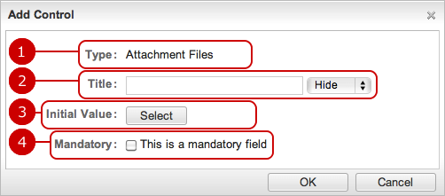
After all entries are completed, when you press "OK" button, the control is added.
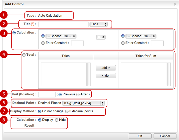
To Add Control (Auto Calculation)
You can perform arithmetic operations and summarize for number controls.
Since calculation results can be used for another Auto Calculation control, you can perform several arithmetic operations.
-
The type of control is displayed.
-
Enter a title text of the control.
If you choose "Display", the title text is displayed.
-
Perform arithmetic operations for fields you selected.
Calculate for input value of a number control and result of other auto calculation control and constants.
-
Sum up of fields you selected.
Sum up of input value of a number control and result of other auto calculation control and constants.
-
Specify a unit.
The unit is displayed before or after the calculation result.
-
Specify decimal point of the number.
Specify 0, 1 or 2.
-
Display method is displayed.
Select whether to display to 3 decimal points or as it is.
-
Choose either "Show" or "Hide" calculation result.
After all entries are completed, when you press "OK" button, the control is added.
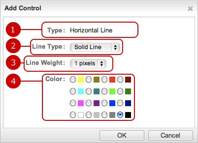
To Add Control (Horizontal Line)
Show a horizontal line to separate fields.
-
The type of control is displayed.
-
Choose the line type.
Choose any one of Solid Line, Dotted Line, Dashed Line.
-
Choose the line weight.
Choose any one of 1 to 3 pixels.
-
Choose the color.
Choose any one of 16 colors.
After all entries are completed, when you press "OK" button, the control is added.
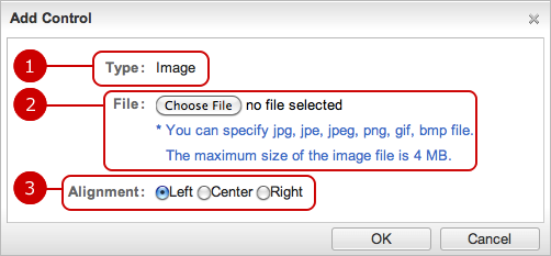
To Add Control (image)
Show image such as logo.
-
The type of control is displayed.
-
Choose a file to show.
-
Choose any one of Choose "Left", "Center" or "Right".
After all entries are completed, when you press "OK" button, the control is added.
Copyright (C) 2012-2016 NEOJAPAN Inc. All Rights Reserved.
